
Best thing since sliced bread.

macstack
You will need to register a new account. And please check your spam folder!
Best thing since sliced bread.
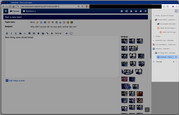
vertical tabs... on the right... 

That seems horrid. But I also usually run with about 4-5 tabs max at any given time.
Since I'm colorblind and don't have the foggiest idea what most favicons actually are supposed to represent or their colors, horizontal tabs are completely unbearable for me, especially when there are many.
I originally hated the idea of vertical tabs, but they're so much better. And they show the whole hierarchy, which tabs came from which others. It makes it really easy to go "Oh, I see I opened all of these tabs in this one group when I was searching for that one thing, and I can close that whole group now at once."
It also makes it super easy to visually group the different topics you're currently searching for, so your shopping could be in one group, your music could be in another, et cetera.
And if you prefer, the button at the top of the column actually allows it to shrink down to just icons without the text, and it expands if you hover. Oh, and you can have it on the left, if you prefer.
My advice would be "Don't knock it til you've tried it."